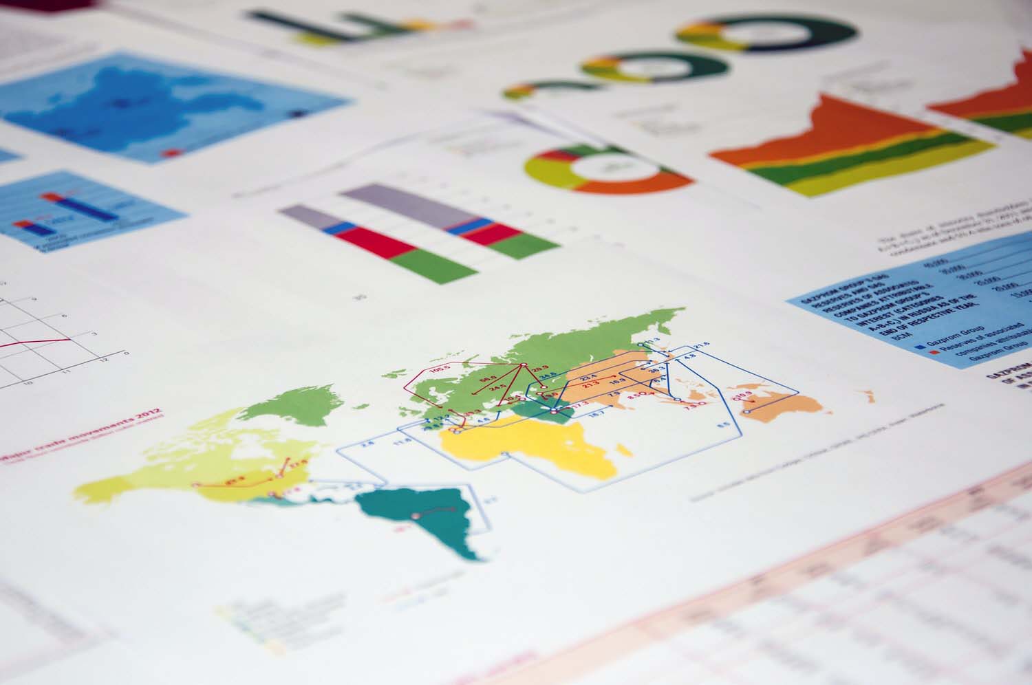
Is your business embracing next-gen data visualisation?
Is your business embracing next-gen data visualisation?By Stephanie Oley
Not too long ago, data visualisation was the realm of geeks. Scatter charts, graphs, pies, matrixes, pyramids, and other data outputs were meaningful mostly to numerate insiders. That made it hard for other skilled professionals to communicate complex changes in a simple, powerful way that resonated with decision-makers outside those teams.
Modern data visualisation – or datavis, as it’s nicknamed – is removing those communication barriers. Tools such as Power BI,Tableau and Tibco Spotfire can simplify, merge, break down or otherwise interpret datasets, using lush graphics to pinpoint the key issues.
These tools are also fairly intuitive in principle. This means analysts and other non-IT professionals can add visualisation skills to their skillset fairly easily, often after taking a short professional development course – not a formal degree.
If data visualisation wasn’t on your radar before, perhaps its exciting new direction could give an incentive to learn it. Foremost among these advances is the increasing likelihood that data will be delivered in video format as early as 2030.
Already, motion-enhanced visuals are helping businesses to generate more meaningful data. The infographics are streamed live, allowing businesses to see the speed or direction of new business flows in real time. Meanwhile, interactive features such as filters allow users to play with the possibilities, by focusing selectively on particular attributes of the data.

Data visualisation Is storytelling with numbers
While datavis tools are straightforward enough to learn, the catch is that a practitioner’s overall approach must be strategic in nature. That’s because data visualisation isn’t just an opportunity to spit out another third-quarter result or product performance. It’s a way of telling the story behind the human decisions and other movements that drive different business outcomes.
For example, teams seeking to grasp a business opportunity might start with a hypothesis. Think of the property redevelopment business as an example. If a team of real estate enthusiasts wants to make the business profitable, where do they start? How can they ensure that every redevelopment is profitable?
First, the team needs to set the basic parameters. Neighbourhoods with a minimum threshold of properties, above-average mean sale prices, and large variances in property value can be some of these parameters.
Data could be effectively collated from the area’s housing database and previous sales records. A little SQL, and a picture soon emerges of which neighbourhoods match the developer’s criteria.
Finally, the team could test all possible outcomes of their theory, using datavis to formulate a null hypothesis and alternative hypothesis to set their action plan. The data can visualise the null hypothesis (the commonly accepted outcome), as well as the alternative hypothesis (less likely outcome). The goal is to establish the alternative hypothesis to become an acceptable outcome.
Data visualisation in practice
Interpreting data with these principles can be applied on an industry-wide scale, too. The Australian business landscape brims with stories of data used to make valuable decisions.
For example, an agricultural board exploring fresh fruit consumption in Australia finds that sales for traditional favourites such as bananas, oranges and apples are down. Various questions emerge: are we collectively eating less fruit? Are any age groups or regions skewing the results? Is the pattern seasonal, or is this the new normal?
By incorporating wider datasets, the board identifies that consumption has increased for non-citrus fruits, such as strawberries and avocados. Using interactive infographic filters, they might additionally focus on particular areas of interest – such as customer personas, seasonal variations, projections against overseas trends, and so on. Armed with this knowledge, the board can now set a strategic direction for the entire industry.
Data visualisation is transforming other industries, too. For example, architects are using infographics to help drive innovations in building designs, by addressing both visible and non-visible site relationships. Medical professionals are using data visualisation to identify new treatment pathways, drawing on sources as diverse as surveys, scorecards, medical dashboards, and manual inputs from healthcare professionals.
Which datavis tool is best for you?
Given the sophistication of modern data visualisation, a common misbelief is that only the technically savvy can use these tools.
However, the current suite of tools allow all users to analyse massive data sets in a few clicks. Being compatible with other standard business software, tools such as Tableau,PowerBI and Tibco Spotfire have a fairly low learning curve.
Both are powerful business tools and have a lot of similarities, such as drag-and-drop data dashboards. They can handle data from a multitude of sources, such as MS Excel, Google Analytics, JSON, SQL and others. The question only remains of which is best suited to your business.
If you’re not sure where to start or still want to polish your knowledge of data visualisation, consider taking an introductory course in Power BI, Power BI: Business Analytics, Tableau or Tibco Spotfire.
Those already comfortable with the Microsoft suite might be more drawn to Power BI, which is compatible with other MS products such as Excel, Azure and SQL. Salesforce’s Tableau is generally considered faster and more sophisticated, with an enormous collection of data connectors and visualisations. Tibco Spotfire is considered more sophisticated yet, but has a steeper learning curve.
With the technical barriers to learn data visualisation now this low, it’s easy to see why professionals from all backgrounds are flocking to learn about this craft.
Featured courses
Navigate Power BI reports and dashboards to uncover business insights. Learn to filter, interpret visuals, and collaborate on datasets. Extract and share data-driven results with confidence, improving your team’s decision-making.
Learn moreLearn to analyse data and create compelling visualisations with Tableau. This beginner course teaches data import, filtering, and basic charting techniques, helping you present data-driven insights effectively.
Learn more